Key Takeaways
- Mobile-first design is a must. A broken mobile experience causes visitors to leave faster and makes them less likely to convert.
- Good design includes page speed. Heavy themes, unoptimized images, and excessive animations can all cause your WordPress site to slow down.
- Each page on your WordPress site needs a clear CTA. Visitors are less likely to convert when they don’t know what to do next.
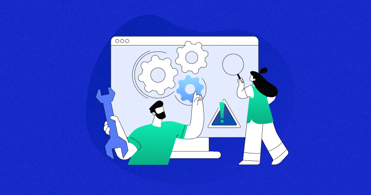
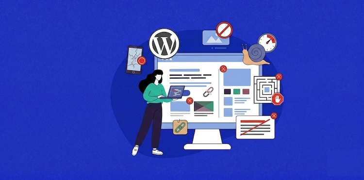
Your WordPress site may look great to you, but if visitors are leaving within seconds, something’s broken. Most of the time, it’s a bad UI/UX design. Confusing navigation, slow-loading pages, intrusive pop-ups, or an unreadable mobile layout can silently drive away the very people you’re trying to attract.
In this guide, we’re breaking down the top website design mistakes that WordPress site owners and designers are making and, more importantly, how to fix them.
You’ll learn how to build a WordPress user experience that engages visitors, establishes trustworthiness, and increases conversion rates, whether you’re creating a new website or improving a current website.
- What UI/UX Means in WordPress Website Design?
- Why Good UI/UX Matters in WordPress Design?
- Top Website Design Mistakes to Avoid
- Weak Navigation Structure
- Slow Loading of Web Pages Due to Design Choices
- Poor Mobile Responsiveness
- Inconsistent Design System
- Weak Call-to-Actions
- Cluttered Layout
- Poor Typography and Content Readability
- Ignoring Accessibility
- Popup and Ad Mistakes
- Broken or Confusing User Flows
- Lacking Elements of Trust and Credibility
- How Better Hosting Supports Better UX
- Tools to Improve WordPress UX
- Final Thoughts
What UI/UX Means in WordPress Website Design?
UI (User Interface) is the graphical look of your website, including buttons, fonts, icons, layout, and colors. A good UI makes the website look consistent, professional, and appealing to visitors.
UX (User Experience) is how a visitor feels about using your website, including how easily they find information, if they can navigate smoothly, and whether they reach the goal without frustration.
In WordPress design, UI and UX work together. A beautiful theme with poor navigation is a UI win but a UX failure. A fast, well-structured site with inconsistent branding is a UX win but a UI problem. The best WordPress websites get both these things right: they look great, and they work flawlessly.
Imagine UI as the look of your website and UX as the feel. They figure out whether a visitor stays and converts or leaves and never comes back.
Why Good UI/UX Matters in WordPress Design?
Poor UI/UX has a real business impact:
- Bounce Rate: If a page is confusing or excessively cluttered, visitors will leave immediately. Search engines will also see it as a sign of low quality.
- Search Rankings: Google’s algorithm considers page loading speed, mobile-friendliness, and Core Web Vitals into account as part of the search experience, and all of these are heavily tied to UX. A poorly designed WordPress site will not only frustrate visitors, but it can also adversely affect your SEO rankings.
- Conversions: Every mistake in your UI/UX is a lost sale, signup, or prospect. Literally, a vague call to action, broken checkout flow, or unreadable product page costs you money.
- User Trust: Initial impressions are made within milliseconds. Bad design, inconsistent branding, or a website that doesn’t work on mobile instantly erodes trust. Visitors associate poor design with poor quality, and they won’t stay around to find out otherwise.
- Accessibility: Everyone should be able to access good UX designs easily. Making your site convenient for visitors with disabilities doesn’t just open up your reach; it’s also turning into a legal necessity in several locations.
Investing in UI/UX is an investment in the continued growth of your WordPress site.
For more useful advice from industry experts on common UI/UX mistakes to avoid, watch the following Cloudways webinar.
Top Website Design Mistakes to Avoid
Here are the most common website design mistakes in WordPress that are silently costing you visitors, with practical fixes for each.

1. Weak Navigation Structure
Navigation is the key component of your website. Visitors abandon your website when it is cluttered, poorly structured, or confusing.
Common mistakes: Too many menu items, vague labels, unclear logical structure, and combining two competing navigation systems on desktop, for example, a horizontal menu alongside a hamburger sidebar menu.
Why it hurts: Poor navigation results in higher bounce rates and directly affects conversion. If visitors can’t find your pricing page, contact form, or product catalog in seconds, they won’t convert.
How to fix it:
- Restrict top-level navigation to five to seven clear, descriptive items.
- Use detailed labels that tell visitors exactly where they’re situated. For instance, “WordPress Hosting Plans” is much better than “Solutions.”
- Don’t mix menu types on the desktop and use one navigation system.
- Include a compelling CTA button to represent your most important action. For example, “Get Started” at the bottom of your navigation bar. This alone can make a huge difference in the number of clicks to your main conversion goal.
- On mobile, adhere to a simple hamburger menu with a short list of important pages.
- Include a search option and make it easy to find, particularly on content-heavy or ecommerce sites.
2. Slow Loading of Web Pages Due to Design Choices
Many WordPress sites are slow to load, and it’s not due to server issues; it’s the design decisions taken at the time of the development process.
Common mistakes: Feature-heavy bloated themes, uncompressed images, excessive animations, too many third-party scripts loading at the same time, and heavy page builders with excessive inline CSS.
Why it hurts: A website that takes an extra second to load can cause a 7% fall in conversions. Slow sites rank lower due to the Core Web Vitals requirements.
How to fix it:
- Choose a lightweight, performance-oriented theme such as Astra, GeneratePress, or Kadence.
- Compress and reduce the size of images before uploading and deliver them in WebP format.
- Use lazy loading technique for images and videos.
- Reduce heavy animations that block the main thread.
- Use a plugin for caching, such as WP Rocket, for serving static copies of your page content.
- Deliver assets via a Content Delivery Network (CDN) from servers nearest to your visitors.
3. Poor Mobile Responsiveness
Mobile traffic now makes up the majority of web visits around the world, yet many WordPress sites continue to treat mobile as an afterthought.
Common mistakes: Text is too small to read, content overflows the width of the screen, buttons are too close together to tap accurately, and desktop navigation does not adapt to screen sizes that are smaller.
Why it hurts: Mobile visitors are often first-time visitors who come across your site through search or social media. A broken mobile experience discourages them from returning.
Google uses mobile-first indexing, meaning it will rank the mobile version of your site. A negative mobile user experience has a direct impact on your search visibility.
How to fix it:
- Perform tests and preview your site on different screen sizes during and following the completion of the development process.
- Body text must be 16 pixels minimum, and content shouldn’t ever go over the edges of the screen.
- Provide tap targets that are at least 44 x 44 pixels in size.
- For better mobile optimization, simplify navigation with a basic hamburger menu.
- Avoid autoplay videos and heavy animations on mobile.
4. Inconsistent Design System
One of the most underrated principles of effective UI is consistency. Multiple fonts, button styles, and colors on different pages make the website appear incomplete and unreliable.
Common mistakes: Every page has different heading styles, buttons that look different on every page, inconsistent use of colors, and different page builder templates that each have their own visual design.
Why it hurts: Inconsistency creates cognitive friction and destroys trust. An inconsistent design suggests you don’t pay attention to detail, and visitors may question your credibility.
How to fix it:
- Define a simple design system. Before you start building, define your colors, typography scale, and button designs.
- Use your theme’s global styles to implement these options consistently across the site.
- Create reusable block patterns in Gutenberg or your page builder for repeated elements.
5. Weak Call-to-Actions
A CTA is the bridge between a visitor browsing and a visitor converting. Weak or misplaced CTAs are one of the most expensive UX mistakes on WordPress sites.
Common mistakes: Commonly used copy, such as “Click Here” or “Submit,” CTAs that are not visually different from the page (low contrast), placing CTAs only at the bottom of long pages, and no CTA in the navigation bar.
Why it hurts: Visitors should never be left wondering what to do next. Missing or weak CTAs mean even the most interested visitors leave without converting, simply because the next steps were unclear.
How to fix it:
- Create a visually striking primary CTA using sufficient padding and high contrast.
- Include action-oriented, benefit-driven CTA copy. “Start Your Free Trial” or “Get My Free Quote” is more effective than “Submit.”
- Place your CTA button above the fold, following major benefit statements, and at different points on longer pages.
- Put a CTA button on your navigation bar in button style, not a simple link.
6. Cluttered Layout
One of the most common WordPress design mistakes is trying to put everything on every page. The outcome is a graphical overload, leaving visitors unsure where to direct their attention.
Common mistakes: No white space in between sections, overloaded sidebars, multiple animated elements competing for attention, and homepages crammed with every product, service, and blog post all at once.
Why it hurts: When every element on a page demands attention, visitors don’t know where to focus. Too much visual leads to cognitive strain, which causes visitors to bounce instead of engage.
How to fix it:
- Keep your homepage focused on what matters: key offerings, social proof, value proposition, and an effective CTA.
- Use white spaces and give your content and sections room to be noticed.
- Ask for every element on the page: Does this help the visitor take the next stage? If it isn’t, discard it.
7. Poor Typography and Content Readability
Typography has a direct effect on how readable, professional, and trustworthy your WordPress site feels. But good typography alone isn’t enough. It’s the layout and structure of the content that will determine whether or not the visitor will actually consume that content.
Common mistakes: More than two typefaces, no clear heading hierarchy, font sizes smaller than 16px, tight line height, dense paragraphs with no breaks, and no subheadings to divide sections.
Why it hurts: Most visitors skim before they read. If your typography is unclear and your content is not structured to support scanning, visitors disengage and leave without finding what they need.
How to fix it:
- Keep paragraphs to two to four sentences.
- Use no more than two typefaces: one typeface for headings, another for body.
- Establish a clear typographic scale using H1 for page titles, H2 for main sections, and H3 for subsections.
- Use descriptive subheadings every few paragraphs to assist scanners.
- Use bullets for list-type content.
- Keep line length between 60 and 80 characters using a max-width container.
- Ensure the font size of the body text is at least 16px, with line height in the range of 1.5 to 1.75.
8. Ignoring Accessibility
An accessible website allows all users to effectively utilize your site, including people with sight, hearing, physical, or intellectual disabilities. It’s not only good practice, but in many areas, it’s becoming a legal requirement.
Common mistakes: Images without alt text, colors with low contrast, no support for keyboard-based browsing, autoplay videos that cannot be paused, and forms with no descriptive labels.
Why it hurts: If you ignore accessibility, you’re missing out on a large segment of your potential audience, including visitors with disabilities.
How to fix it:
- Write descriptive alt text for every image. Describe what it shows in context.
- Verify the contrast of colors with the WebAIM Color Contrast Checker. Try to keep the ratio at least 4.5:1.
- Press Tab through your site to test keyboard-based navigation functions. Focus states must always be visible.
- Add labels that are descriptive to all form fields. Never rely on placeholder text alone.
- Provide controls for stopping or resuming all moving content, including carousels and animations.
9. Popup and Ad Mistakes
Popups and ads can drive sales conversions and generate potential customers when used well, but they are among the fastest ways to frustrate visitors when used poorly.
Common mistakes: Popups firing the moment a visitor lands, multiple popups stacking simultaneously, ads causing layout shift as they load, and popups that are difficult to close on mobile.
Why it hurts: Popups that interrupt before a visitor interacts with your content feel intrusive. Ad-related layout shifts make pages feel unstable, which destroys the reading experience and contributes to poor Core Web Vitals.
How to fix it:
- Delay popups and show them after at least 30 to 60 seconds on the page or after scrolling through a significant portion of the content.
- Never stack multiple popups and prioritize one message at a time.
- For cookie consent notices, consider a less intrusive bottom banner rather than a full-screen overlay.
- Reserve space for ads in the layout you choose before the page loads to avoid layout displacements.
- Keep popup forms simple and ask only for essential information, typically just an email address.
10. Broken or Confusing User Flows
A user flow is the path a visitor takes to complete a goal on your website. That goal could be a purchase, booking a service, completing an inquiry form, or subscribing to a newsletter. When this journey becomes unclear or unnecessarily complex, visitors abandon the process entirely.
Common mistakes: Checkout processes with too many steps, forms asking for excessive information upfront, no acknowledgment message after submission, and requiring account creation before checkout in WooCommerce.
Why it hurts: Every point of friction is an opportunity for the visitor to give up. Broken flows also create distrust. If your site cannot process a form correctly, visitors will not trust it with their money.
How to fix it:
- Walk through every key user flow yourself as a first-time visitor and eliminate friction points.
- Enable checkout for guests in WooCommerce and include a progress indicator for multi-step checkouts.
- Keep contact forms short. At the first stage, ask only what you really need.
- Ensure to send a confirmation message after submitting a form, telling visitors exactly what happens next.
- Test every form, button, and link on your site regularly, since site owners often fail to notice broken flows.
- Give specific messages for errors. For instance, “Please enter a valid email address” is far more helpful than “Invalid input.”
11. Lacking Elements of Trust and Credibility
Visitors decide in seconds whether to trust your website. If your site lacks the signals that communicate credibility, even well-designed pages will fail to convert.
Common mistakes: No SSL certificate, missing or thin About page, no reviews from customers or testimonials, no visible contact information, and outdated copyright dates in the footer.
Why it hurts: Conversion is a matter of trust. Every missing trust signal is a reason for a visitor to hesitate, and on the web, hesitation almost always results in leaving. Establishing trust with UI/UX is not a choice; it’s a necessity.
How to fix it:
- Write a genuine About page that explains your journey and highlights your level of expertise.
- Check to make sure your site has a real SSL certificate and that it’s served via HTTPS. If you decide to host your site on Cloudways, free SSL certificates are included for all hosted sites, making this effortless to set up.
- Feature testimonials from customers. Showcase reviews on your homepage and key conversion pages.
- Make sure your contact information is available in your dedicated Contact page.
- Keep your copyright year current. Update it automatically using a dynamic WordPress function.
How Better Hosting Supports Better UX
Most WordPress site owners focus entirely on design when thinking about UX. But a web hosting system is an important part of the experience your visitors have. Even an exquisitely designed site will give a disappointing user experience if it sits on low-speed, unreliable hosting.
These are the major hosting factors that directly affect your WordPress UX:
- Fast Web Server: A more efficient hosting server means the page will load faster, which directly lowers bounce rates and improves conversions.
- Stable Performance: Reliable hosting ensures your visitors get the same fast experience regardless of when they visit, not just during off-peak hours.
- Managing Web Traffic Peaks: Good hosting will grow with your traffic so that your site stays up and handles traffic gracefully during unexpected surges. This is critical for WordPress ecommerce sites during high-traffic periods, like seasonal sales and product launches.
- Safe UX Testing: Staging environments allow you to safely test design changes and new plugins before pushing them live. That means you can iterate on your UX without ever risking a broken experience for real visitors.
Good UX starts with a strong hosting foundation. If you’re looking for a fully managed cloud hosting solution that provides faster load times, stable performance during traffic peaks, and safe staging for design changes, Cloudways is worth exploring.
Managed WordPress Hosting Built to Support Better Website Design
Cloudways gives WordPress sites the speed, stability, staging, and backup tools needed to support smoother design updates and a better visitor experience.
Tools to Improve WordPress UX
Here’s a quick list of the essential tools that you can use to continuously track, evaluate, and optimize the user experience of your WordPress site:
UX Testing and Analytics
- Hotjar: Heatmaps, user input-based surveys, and session-based recordings to see how visitors navigate your site and where they leave.
- Microsoft Clarity: Heatmap data, session-based recordings, and click and scroll tracking to find usability issues on your WordPress site.
Performance Testing
- GTmetrix: Detailed page speed analysis with Core Web Vitals to see what might be making the WordPress site slower.
- Google PageSpeed Insights: Analyze mobile and desktop performance with Google’s Core Web Vitals and optimization suggestions.
Design and Prototyping
- Figma: Industry-standard design tool for planning layouts before building.
- Elementor / Gutenberg: Build responsive pages, test layout changes, and make improvements to the structure of pages without heavy custom development.
Accessibility Testing
- WAVE: Browser-based tool that visually highlights accessibility errors on live pages.
- WP Accessibility: WordPress plugin for solving common accessibility problems and improving browsing performance.
Final Thoughts
UI/UX is not a one-time project. It’s a continuous commitment you make to your visitors. Each enhancement you make translates into more user engagement, better conversion rates, and a stronger WordPress presence.
Figure out your significant gaps and work on them systematically. You don’t need to solve all issues at once. Consistent little improvements make for a significantly better experience.
Good WordPress design is not only about appearance. It’s focused on building an experience that works for every visitor who lands on your site. If your site is quick to load, uncluttered, easily accessible, and simple to navigate, visitors stay longer, trust you more, and are far more likely to convert. That is the real power of good UI/UX design, and it is well within your reach.
Q1: What makes a website poorly designed?
A poorly designed website is difficult to navigate, slow to load, difficult to read, or unclear about what visitors should do next. Common signs include cluttered layouts, weak CTAs, poor mobile responsiveness, low-contrast text, intrusive popups, and a lack of trust signals like reviews, HTTPS, or contact information.
Q2: What is the most important thing in website design?
The most important thing in website design is to make it easy for visitors to accomplish their goal. Every design choice, from layout and navigation to buttons and the structure of content, should lead users to the information or action they came for, without confusion or extra effort.
Q3: What makes a successful website design?
A successful website design balances appearance, usability, and performance. It communicates your brand perfectly, creates a consistent experience across pages, and makes the site feel professional from the moment someone lands on it. Better yet, it helps your business goals by encouraging visitors to stay longer, interact with your content, and take meaningful action.
Nisha Thomas
Nisha is a technical content writer with a passion for translating complex technology into content that’s clear, practical, and enjoyable to read. With strong technical insight and a user-first mindset, she crafts guides that help readers understand and use modern tools and platforms.