


Key Takeaways
- Mobile optimization improves user experience, engagement, and search visibility on WordPress sites.
- Slow mobile performance often results from unoptimized images, excessive plugins, and missing caching.
- Testing tools like Lighthouse, GTmetrix, and PageSpeed Insights help identify mobile performance issues.
- Techniques like responsive design, caching, lazy loading, and CDN integration enhance mobile site speed.
Ever got stuck waiting for a website to load on your phone?
Frustrating, right?
In today’s mobile world, a slow site can cost you visitors. Think with Google says 58% of smartphone users prioritize businesses with mobile-friendly websites.
But what if your WordPress site isn’t optimized? Studies show that a whopping 90% of visitors bounce from mobile sites, taking over 5 seconds to load.
The good news? WordPress mobile optimization is easier than you think! This guide offers 15+ best practices to supercharge your mobile performance.
Let’s get started!
Why Should You Optimize WordPress for Mobile?
Optimizing WordPress for mobile is crucial as it ensures a seamless user experience, leading to increased engagement, better conversion rates, and improved search engine rankings.
Given the rise in mobile internet usage, totaling 5.61 billion users in January 2024, having a mobile-friendly WordPress site is necessary.
Adapting to different screen sizes aligns with user preferences and effortlessly captures and retains visitors.
Experience Instant Mobile Speed Boosts with Cloudways
Cloudways’ managed WordPress hosting is specially optimized to break you free from annoying loading times and performance issues. Try it free today.
Common Reasons for Slow Mobile Performance
Several factors can impact your WordPress site’s mobile performance. Here are a few of them:
1. Unoptimized Images & Animations
Images and animations enhance your site but can also slow it down on mobile devices. Make sure images are compressed for faster loading, and use animations sparingly.
2. No Mobile Caching
When users visit your site, their device stores certain files (like images) to speed up future visits. This is called caching. You can significantly improve mobile load times by enabling a mobile-specific caching plugin like WP Rocket or WP Super Cache.
3. Plugin Overload
While plugins add functionality, too many can bog down your site. Stick to essential plugins and regularly check their impact on speed using a performance testing tool like Google PageSpeed Insights.
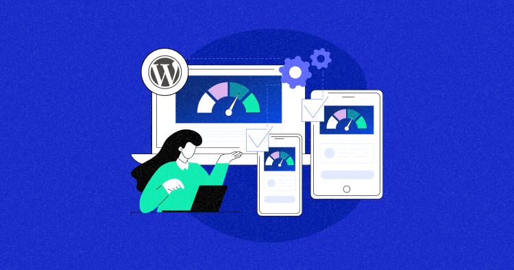
How to Check WordPress Mobile Page Speed?
Before you start working on speeding up your WordPress mobile site, start by checking how it’s doing right now. You want to understand how your website loads for mobile visitors.
To do this check, you can use any of these tools:
- Google Lighthouse
- Lighthouse Metrics
- Google PageSpeed Insights
- Chrome Developer Tool
- GTmetrix
- WebPageTest
- Google Mobile-Friendly Test
Here’s how you can use these tools to get a good idea of how quickly your mobile site is running and figure out where to make improvements.
1. Google Lighthouse
Lighthouse is a free, automated tool that provides valuable insights into your web pages’ performance and overall experience.
You can use it by installing a Chrome extension or directly accessing DevTools within your browser.
I tested Walmart’s homepage using Lighthouse’s Chrome browser extension.

2. Lighthouse Metrics
Lighthouse Metrics is a user-friendly tool to test your WordPress site on mobile in multiple locations. You can run tests from up to 16 regions with a single test.
Copy and paste the URL you want to test and click “Run Test.”
If you notice variations in speed across regions, consider trying our Cloudways Cloudflare Enterprise add-on to improve loading times for users farther from your servers.
3. Google PageSpeed Insights
PageSpeed Insights provides the simplest way to assess Core Web Vitals for WordPress websites. Enter your website URL, click the Analyze button, and let the tool do the work.
Once the analysis is complete, PageSpeed Insights displays Core Web Vitals under the ‘Field Data’ section. At the top, the field data indicates whether the page passes the Core Web Vital assessment.
You can view scores for all three Core Web Vitals and aim to improve them based on Google’s recommended scores:
- Largest Contentful Paint (LCP) – 2.5 seconds
- First Input Delay (FID) – Less than 100 milliseconds
- Cumulative Layout Shift (CLS) – Less than 0.1
4. Chrome Developer Tool
You can also generate a mobile performance report for your website using Chrome Dev Tools directly in your browser.
- Go to your website.
- Open “developer tools” from the top menu.
- Select the “Lighthouse” tab.
- Check the “Mobile” box under the “Device” section.
- Click on the “Analyze page load” button.
5. GTmetrix
GTmetrix is a web performance testing tool that can help you analyze your website’s speed and performance and identify bottlenecks.
The above test result is for desktops, but if you opt for the GTmetrix Pro, you can conduct specific tests on various mobile devices. Read more on How to Use GTmetrix on WordPress.
6. WebPageTest
WebPageTest is a free web page performance testing tool that helps identify slow-loading pages on your WordPress site.
It covers testing for Site Performance, Core Web Vitals, Lighthouse, Visual Comparison, and Traceroute. Simply input the URL and click “Start Test” to initiate the testing process.
7. Google Mobile-Friendly Test
The Mobile-Friendly Test is a tool that simplifies mobile site testing, providing insights into a website’s mobile responsiveness score.
By entering your website’s URL and clicking “Test URL,” you can quickly determine if your page is usable on mobile.
In case of any issues, the test identifies specific errors and guides you toward helpful resources to enhance your site’s mobile-friendliness.
Tips to Optimize WordPress Mobile Site for Speed
Here are some actionable tips to optimize your WordPress mobile site for speed and to keep your visitors happy.
1. Choose a Reliable Web Host
A reliable web host is like having a solid foundation.
Just like a strong foundation keeps a house from crumbling, a reliable host ensures your website runs smoothly. This translates to fast loading times, especially for mobile users on slower connections.
Think of it this way: an unreliable host might overload or struggle during peak traffic times, causing your website to slow down. This can frustrate visitors and lead them to bounce off your site. Cloudways Autonomous provides highly available WordPress for a reliable experience.
2. Prioritize Responsive Design and Testing
Choose a responsive WordPress theme designed with mobile users in mind. Look for themes with high user ratings for mobile efficiency.
Once you’ve selected a responsive theme, customize it to align with your brand and content.
After implementing a responsive layout, ensure thorough testing across various devices and resolutions. Manual testing on smartphones and tablets is crucial for assessing responsiveness and usability, ensuring a positive user experience.
3. Optimize Images and Content for Mobile
Optimizing images and content ensures faster load times and improved user engagement.
Follow these techniques for effective image optimization:
- Compress Images: Achieve a balance between image quality and file size, reducing load times without compromising visual integrity. Cloudflare Polish is an image optimization solution that offers effortless optimization with just a single click.
- Resize Images: Maintain a standard size, 640 by 320 pixels, or adhere to the “4:3 aspect ratio” for optimal mobile viewing.
- Choose the Right Format: Opt for WebP, the superior mobile format that ensures efficient compression for faster loading.
- Use Cloudflare Mirage: Cloudflare Mirage is designed to cater to mobile users and low-bandwidth connections. It automatically adjusts image loading based on the visitor’s device and network conditions.
When optimizing mobile content, adjust it to meet your visitors’ needs:
- Compress text for legibility on smaller screens.
- Use shorter paragraphs and simpler language.
- Prioritize relevant and engaging content
- Minimize excessive scrolling or clutter.
Boost Your WordPress Mobile Speeds with Cloudflare Polish!
Optimize your images and experience faster page loads and improve user engagement on your mobile WordPress site.
4. Streamline Your Mobile Navigation
When people visit your site on their phones, they don’t want to spend ages hunting for what they need. Simplify your menus and make navigation super clear so visitors can find the information they want quickly and easily. User testing platforms such as UXtweak allow you to test your navigation and adjust it to how your users interact with it.
Mobile screens are small, so a cluttered menu can be overwhelming. Focus on the most important sections of your site and group related items together. You can also use a hamburger menu (those three horizontal lines) to hide additional options without sacrificing usability.
Cloudways.com view on iPhone 14 Pro Max
5. Embed Objects Responsively
When embedding YouTube videos or infographics on your website, you may have observed that they come with predetermined width and height settings. This can negatively impact the experience for mobile visitors.
To mitigate this issue and ensure optimal viewing on mobile devices, consider adjusting the dimensions or using responsive design techniques that adapt to different screen sizes.
For example, the Simple YouTube Responsive plugin can make embedded YouTube videos responsive.
6. Enable Mobile Caching
Mobile caching is a common technique to reduce the load on an application and its servers. Cloudways’ Device Detection feature lets you set up a cache specifically for mobiles if your site has customized content for them.
If your website design adjusts well to both big screens and phones using responsive HTML/CSS, a separate mobile cache might not be needed.
7. Implement Lazy Loading
The lazy loading HTML attribute is a technique web pages employ to optimize load times. When activated, it ensures that the web page loads only the content the user is currently consuming.
This delayed loading of yet-to-be-seen media enhances overall performance and reduces loading times. You can add lazy load to your WordPress site through plugins like a3 Lazy Load.
Check out our guide on WordPress Lazy Load to speed up web pages.
8. Optimize Image Delivery with CDN
Images are great, but they can also slow down your website. To keep things speedy, use a CDN like Cloudflare. This basically stores your images on servers worldwide, so they load quickly no matter where your visitors are located.
Visualization of how a CDN works
9. Improve Time To First Byte
Addressing Time to First Byte (TTFB) is super important. I can’t stress that enough. Therefore, optimizing server-side scripts like PHP or SQL is crucial, as they directly influence TTFB.
Also, be selective when using page builders, themes, or plugins to improve all Core Web Vitals metrics.
You can also leverage Cloudflare’s Brotli compression feature, an open-source compression algorithm known for its superior compression ratios compared to GZIP. This can significantly improve TTFB times and contribute to a faster-loading WordPress site.
10. Eliminate Render-Blocking Resources
Some websites make you wait forever to see anything on your phone. That’s often because of render-blocking resources. These are things like images or videos that slow down the entire page from loading.
Tools like Google’s PageSpeed Insights can help you identify these troublemakers. Once you know what they are, you can optimize them to load faster or make them load asynchronously (think of it as loading them in the background without slowing down the rest of the page).
You can read more about How to Eliminate Render-Blocking Resources in WordPress.
11. Reduce Page Weight
A lighter page means a faster load on your mobile! If your page feels heavy, it’s probably packing videos, images, scripts, styles, and fonts.
To effectively trim down your page weight, focus on image optimization. Minimizing, removing unused CSS, and compressing JavaScript code remain essential in diminishing file sizes, enabling faster fetching and execution of these resources.
12. Avoid Using Sliders, Animations, Preloaders, or Pop-Ups
Sliders, animations, and flashy pop-ups might seem appealing, but they can actually slow down your mobile site. Google likes fast and user-friendly websites, so it’s best to keep your mobile design simple.
Use regular images instead of sliders, and store data locally on visitors’ devices (called caching) to make things run smoothly. This will give your mobile visitors a much better experience.
13. Manage Ads Effectively
Ads are a great way to monetize your website, but they can also slow things down, especially on mobile. Imagine someone visiting your site on their phone and getting hit with a big ad immediately. It’s not a great experience!
That’s where lazy loading comes in. This tip lets you hold off on showing ads until visitors scroll down to the part of the page where the ad will be. This way, your website’s content loads faster, keeping visitors engaged.
14. Avoid Pop-up Banners
Those annoying pop-ups block your visitors’ view when they land on your website. They’re a big no-no for mobile users. Pop-ups slow down loading times and make it frustrating to navigate the site.
Imagine trying to read an article on your phone, but a giant pop-up covers half the screen! Not ideal, right? That’s why avoiding aggressive pop-ups is important, especially on the first page of your mobile website.
15. Implement Google AMP
Accelerated Mobile Pages (AMP) can be your secret weapon for boosting your mobile search ranking. AMP creates ultra-fast versions of your web pages specifically designed for mobile users. Imagine a lean, mean content machine that loads in a blink – that’s AMP!
This lightning-fast experience not only keeps visitors happy but can also help your website climb the search engine rankings. Plus, it’s easy to set up – just install a free AMP plugin, and it will take care of the technical stuff.
Once you install and activate the plugin, it will automatically create super-fast versions of all your web pages for mobile users. This keeps your mobile visitors happy and might even help your site rank higher in search results!
Source: Digital Muscle
Summary
So, there you have it! With these WordPress mobile optimization tips in your toolbox, you can build a WordPress website that offers a great user experience on mobile devices. Imagine your visitors – no more waiting impatiently for pages to load or bounce back to other websites.
They’ll be greeted with a smooth, lightning-fast experience that keeps them engaged. Remember, a happy mobile user is a loyal user, and a speedy site also translates to better SEO, potentially bringing in more visitors through search engines. It’s a win-win!
Q1. How do I optimize my WordPress mobile?
A. Choose a mobile-friendly theme or plugin to optimize your WordPress site for mobile devices. Prioritize responsive design, optimize images and code for quicker loading, and avoid elements like pop-ups that may affect the mobile user experience.
Q2. How do I increase mobile speed in WordPress?
A. To increase mobile speed in WordPress, consider faster web hosting, optimize images, use a fast CDN, employ a caching plugin, choose speedy plugins/themes, optimize JavaScript and CSS files, and focus on improving Core Web Vitals while reducing page weight.
Q3. Why is my WordPress site so slow on mobile?
A. Your WordPress site may be slow on mobile due to large or poorly designed images that take too long to load. Additionally, large JavaScript and CSS files can contribute to mobile performance issues.
Q4. How to make a WordPress website mobile friendly?
A. To make a WordPress website mobile friendly, start by ensuring it uses a responsive theme or design so content automatically adjusts to smaller screens. Optimize media and page weight by compressing and resizing images, using lazy loading, and minimizing heavy scripts because unoptimized images or animations are among the main causes of slow mobile loading. Enable mobile specific caching and CDN delivery (e.g. a CDN + caching setup) to speed up load times for mobile visitors. Finally, test and iterate using mobile focused tools like Google PageSpeed Insights, GTmetrix or Lighthouse to catch performance issues and validate the mobile user experience.
Abdul Rehman
Abdul is a tech-savvy, coffee-fueled, and creatively driven marketer who loves keeping up with the latest software updates and tech gadgets. He's also a skilled technical writer who can explain complex concepts simply for a broad audience. Abdul enjoys sharing his knowledge of the Cloud industry through user manuals, documentation, and blog posts.

