EXPLORE CLOUDWAYS
Experience lightning-fast loading times and seamless platform
View Demo >PRODUCTS
CLOUD PROVIDERS
SUPPORTED APPS
WHO WE SERVE
PARTNERSHIP PROGRAMS
Lifetime deal: 75% OFF
Advanced Support
POWERFUL FEATURES
DISCOVER
WHY CLOUDWAYS
 Read Case Study >
 Jesse Tutt
Founder & CEO

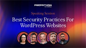
Common UI/UX mistakes quietly hurt both usability and performance. This Prepathon 2024 panel breaks down mobile-first design, navigation, popups, and accessibility.
🎙️ Speakers
▸ Karlijn Löwik — CEO & Co-founder, RUMvision
▸ Michelle Frechette — Director of Community, StellarWP
▸ Bogdan Condurache — Co-founder & Head of Design, Brizy
▸ Shelly Fagin (Host) — Director SEO, DigitalOcean
✨ Key Takeaways
✦ Design mobile-first: most first-time visitors arrive on mobile and Google ranks on the mobile experience, but don’t neglect desktop.
✦ Know your audience’s devices; heavy animations and videos may run fine on your phone but not on older, lower-end ones, hurting INP.
✦ Keep navigation simple, don’t overdo mega menus or mix menu types, and set key CTAs apart as buttons (one panelist saw 3x the leads).
✦ Don’t fire popups in the first seconds; reserve space for ads to prevent layout shift, and prefer subtle bars or landing pages.
✦ Accessibility basics matter: alt text, color contrast, readable fonts, keyboard focus, and motion toggles, and be cautious using AI for alt text.
✦ Accessibility is becoming law (EU 2025), grows your market, and helps SEO, and an accessible site can still be beautiful.
Shelly Fagin: Hi everyone, hi, welcome. I’m very excited to be back here for the last session of the day. It’s one you definitely don’t want to miss, so make sure, if you were here for the previous session, you stick around. We are going to cover UI and UX mistakes that you want to avoid on your, or your client’s websites. We have a round table panel today, some wonderful, brilliant panelists, I’m super excited for the conversation. I’m going to start and bring up our first panelist, we have Karlijn, come on up. Hi, hi, welcome.
Karlijn Löwik: Thank you, excited to be here.
Shelly Fagin: We’re excited to have you. I wanted to give you a chance, you are the founder and CEO of RUMvision, but I wanted you to do a little intro on yourself, tell us about RUMvision, a little bit about your background.
Karlijn Löwik: Yeah, thank you. Yes, so RUMvision is actually, well, an extension of what Adam just talked about. What we do is we offer a solution to monitor those Core Web Vitals and experiences that your users have in real time. So did they have a slow interaction, where was it, what did happen, we can show them that. But also, yeah, help you out with all the performance issues that you have, and make it much easier to troubleshoot and make sure that your users get the best experience. We actually even introduced the term for it, Site Speed User Experience, so, SUX. So together with UX and UI, today I’d like to bring SUX to the table.
Shelly Fagin: I love it. I’m a site speed fanatic, so it’s right up my alley, I’m very excited. I want to go ahead and welcome up our next panelist, we have Michelle, come on up to the stage. Michelle is the director of community at StellarWP, I guess I’m always trying to pronounce WordPress, but WP, and Post Status as well. Welcome.
Michelle Frechette: Thank you, it’s good to be here.
Shelly Fagin: Thank you. I would love for you to give us a little intro on yourself and StellarWP.
Michelle Frechette: Sure, so I’m the director of community engagement for StellarWP. We are a suite of plugins and themes that work with your WordPress website, everything from security to fundraising to, gosh, we have everything, learning management system and calendaring, there’s so much that we have there, including Iconic and Orderable, which work really well for online ordering for the upcoming Black Friday time. So anything that you might need to do with WooCommerce, we’ve got you covered there too.
Shelly Fagin: Amazing, I can’t tell you, struggling especially with the learning management stuff and finding events plugins to have it all together in one, amazing, so very excited. Thank you for joining us today. We have one more panelist as well, we have Bogdan, and he is a co-founder and head of design at Brizy. Welcome.
Bogdan Condurache: Hello, thank you, thank you, glad to be here, and hello everyone in the attendance and the other speakers, we are so glad to have you.
Shelly Fagin: Please, real quick, quick intro yourself, tell everyone about you and Brizy.
Bogdan Condurache: Sure, I’m the co-founder and the head of design, mostly guilty for most of the stuff in the pipeline, product wise, website wise, and even the templates in our website builder at Brizy. So yeah, I think I’ve seen it all and done all the mistakes in the business during this, I don’t know, 15, 20 years since I’ve been doing this. So yeah, with a background in economics mostly, but a fan of design and art, and I never did any economics, I only did design and illustration. So yeah, I’ve done it all.
Shelly Fagin: Well, design is obviously key to user experience, so very excited to have you here today. I have some stellar questions I want to go ahead and kick off, but I want to encourage everyone, all of our attendees, to ask questions in the chat. We’re going to try, if we have time at the end, we may or may not have time to answer user questions, but I highly recommend, hopefully our speakers will get a chance to look through them, maybe you can follow them on social if you do not get an answer and they can respond directly. Thank you.
Kicking off, talking about mobile first design, or more specifically, people have a tendency to neglect it. So mobile usage obviously is continuing to grow and is the primary, yet some clients still focus very closely to desktop and they don’t pay attention to mobile. How would you persuade them essentially to switch their approach, and also do that without compromising the desktop experience? Who wants to take it away?
Michelle Frechette: That’s a good question, I’ll go ahead and jump in, but I’m going to guess that Bogdan has a lot of ideas for this because of the design necessity for it. I once had a customer who insisted that his site look exactly on mobile as it does on a desktop, so no mobile anything. And I had to convince him that he was wrong in a kind way, because I still wanted him to pay me at the end of the day. And so I told him, I would really like you to sit with this and think about it, look at it again on your mobile site. He talked to a friend who said, are you crazy, of course you want it to look like it’s supposed to on a mobile device. And that friend was able to convince him, because number one, the aesthetics were better, and number two, people want to be shopping and using their mobile phones almost more than they do their desktops now. And so to neglect that is to neglect customers and also revenue. But I’m going to let Bogdan jump a little more into what that design looks like, because that’s his area of expertise.
Bogdan Condurache: I sure can do it. I didn’t want to jump first before the ladies, so I just wanted somebody to take the lead. But actually that’s a great question, because if you look at the statistics, it’s getting way ahead in mobile usage and visitors on mobile than on desktop. Desktop is of course a great viewport, we all need an awesome looking website for the times when we’re on a laptop, maybe at a desktop, I don’t know, but most people start to look on their mobile device, and if stuff doesn’t look right, you don’t need to be a designer to know that that’s a weird website and you should not trust that company that has a website on their mobile that looks like 20 years ago.
So basically do something with it, use all the tools that you need, these are super easy to use right now with all these viewport optimizations from desktop to mobile to tablet, and just simplify the things that look messy, make the fonts bigger, create some space. The spacing in mobile is very very important, let the content breathe, have good enough spacing from the margins. If text reaches the margin, you’ve done it wrong, I say it again, it’s too close to the edges, and then your website will look crappy even though it isn’t, maybe it’s the best loading website in the world, if the text is too close on mobile it’s looking weird. That’s just a quick one, I don’t want to delve too deep into this, but it’s very important, the mobile first. And just if you need to persuade somebody, just tell them, these are the statistics, look at this, I don’t have them at hand right now, but it’s easy to find, and it’s overwhelmingly mobile. And animation should be faster, so I think Karlijn will tell us about site optimization for mobile, which is not an easy task.
Karlijn Löwik: No, no, it’s more of a challenge. But actually what I also wanted to say, if we are talking mobile first, what we very much see, because we actually do have the statistics as a RUM tool, mobile first are, very often the users that are browsing your site for the first time, they are the ones that come in through Google Shopping for instance. Because if I’m just on my couch, I’m the one browsing and then I maybe want to buy something, but if I can’t browse on my couch because the site is poor, or the experience is poor, or I can’t read it, then why would I even consider buying stuff? If I know a brand and I know it, then I might buy from it from desktop, but especially to those users for the first time that can become your loyal customers, it’s so important to have a good mobile first website with a good design as well as a good site speed experience. So yeah, there are many reasons why you would want to adopt a mobile first design for that.
Shelly Fagin: Yeah, absolutely, I could not agree more with all your points. Also the SEO in me wants to point out that Google’s algorithm also takes your mobile experience into consideration for ranking purposes, so if you rely on organic traffic, mobile is crucial. Oddly enough, I work for one company who primarily still gets desktop traffic, we’re like an anomaly, but historically with a lot of companies we’re pretty much seeing like, what, 80% up in mobile versus desktop.
Fantastic. I’d be curious, have you ever encountered any situations where a mobile first design improved user engagement, what were the factors that made a difference?
Bogdan Condurache: Yeah, we’ve seen this quite a lot, because sometimes it’s much easier to just scroll a bit and find the info, and also if you know how to do it for, I don’t know, mobile numbers, phone numbers especially, it’s just a link, it’s not complicated, it’s much quicker to just phone it in, make a reservation, call somebody on the support or stuff like that. It just brings a bit more, more quicker, some information. And the amount of power that these phones have right now is just flawless, they scroll perfectly. There was a time where we were advised not to use like videos in the background on mobile websites, or stuff that complicated the mobile experience and it drained battery, but these days the phones are super super quick. But of course you shouldn’t overdo it, just don’t put all the videos and the animations and, I don’t know, animated icons or stuff like that, that’s just too wasteful for the cycles and your optimization score will be bad.
Karlijn Löwik: Yeah, yeah, you kind of saw it coming on my end, I think, raise the hand and say, just hold on all the, never, just make sure that you do know your audience. Because if you’re in a country where people actually not have the latest iPhone, or have very bad internet, but especially, people don’t often notice, but if you have an older phone, well, kind of what Bogdan is saying, then the experience on site will be worse. Because while phones do improve, the JavaScript and the heavy videos get embedded actually multiply as well. So to come back to the last talk which talked about Interaction to Next Paint, so the responsiveness of your site, what we very often see is that if we have a lot of animations, if we have a lot of videos, a lot of A/B tests and heat maps and everything, your mobile phone, well, your mobile phone might be able to handle that, but my mobile phone might not. And it’s important to remember that I might buy from you as well, so you want a good experience for all.
Bogdan Condurache: Yeah, I completely agree, and I don’t want to go too much on this, but I have a personal experience when we’ve made a website very beautiful for a client that’s dear to us, and we wanted to make it so cool that we overdid it. We used some crazy effects like CSS with SVG filters, which is something that’s taxing, and I don’t know, it worked on our laptops and phones, but when the client was using like a five year old laptop, let’s say, which is still decent, it just broke down their computer into flames, because it was so hot. And they said the site is looking great but I think this website just killed my CPU, and we had to dial it down and said maybe find a way to make it less beautiful but way more performance ready. So yeah, just find a way, don’t overdo it.
Karlijn Löwik: Yeah, and know your audience, that’s so important as well. I mean, you can actually get that info, or at least you can get it from a RUM, what kind of device does your audience have, and if they all have 8 gigs of RAM or more, then you can get away with so much more than if there are lower end phones in your general population.
Michelle Frechette: But the other thing about remembering your audience is which device are they more likely to use for that scenario also. So for example, I’ve built several websites for restaurants, and more people are looking for restaurants on their phone because they’re in their car, where do they want to stop to eat and those kinds of things. So if you haven’t designed for mobile, they’re going to move on to the next restaurant that they can find information on, for sure. So I think there’s a lot that goes into thinking about your audience before you design anything, including their devices, but also your audience for that particular site, for sure.
Bogdan Condurache: Yeah, but also don’t completely forget about desktop, why not both, I say. Mobile first, let’s say, it’s mobile and desktop equally, because they can be equally pretty and equally be actionable, but don’t forget about mobile, it’s so important.
Shelly Fagin: 100%. So, shifting over topic wise, this is probably one of those things that’s very complex and is definitely a point of contention I think across a lot of people depending on their area specialty. So I’m curious your thoughts on navigational menus, especially complex or cluttered. What strategies do you recommend for simplifying? Is there a point where it’s too much, but at the same time simplify without sacrificing functionality?
Michelle Frechette: This is why I say the customer isn’t always right, so whoever is the site owner doesn’t necessarily know what’s best for them. I built a mega menu years ago that had an icon of their logo next to every single drop down on that mega menu. Not only was it slow, I mean, I had to show them why it didn’t work before I could strip it down and put it back to normal, but it was slow, it was hard to use. The mega menu feature, like if you shifted your mouse even a tiny little bit you were no longer on that, it wasn’t great for mobile, and so some of those navigation systems, they look beautiful on your site but they are just a nightmare for actual use.
Shelly Fagin: Yes, absolutely. Curious, who has suggestions for like, what are best practices regarding navigation menus today?
Bogdan Condurache: I think the simpler you keep it, but I’m not against mega menus, mega menus can work very very well, but also not overdo it. I think this is a theme of the discussion today, not overdo it, because some mega menus tend to be overwhelming and you don’t actually know where to look into that mega menu, and it’s just column and column and icons and animations and stuff in that. Just keep it simple, in three rows tops, maybe two, I don’t know, or columns, whatever. But what I suggest, and this is also a mistake that I’ve personally did, was combining a regular menu on the desktop, let’s talk just about the desktop, a regular menu that was a horizontal menu of items, let’s say like five or six items, and then I was thinking of being maybe fanciful and just add a hamburger menu also in the desktop, that should open up a sidebar and do something fancy and stuff like that, and people never understood what they are supposed to click. Is it the top menu which is simple, or click the hamburger menu which slided something from the sidebar, and it was just a mess, and people told us, oh, we don’t know what to do here. And yeah, since we removed that hamburger menu on the desktop it was much better. Of course on the mobile device the hamburger still is the best way to do it, even if I’m not the biggest fan of it, it’s just a simple way to display some list of items and it works, it works better. So keep it simple, use mega menus only if you need to, and if you have a lot of content that you need people to find. So yeah, but don’t combine two different types of menus, I mean a horizontal one and a mega menu inside the desktop.
Michelle Frechette: That would be incredibly confusing. I’ve also talked to people before about the fact that you need to remember what your call to action is. So if you are trying to sell something, then your navigation is probably going to look much different than a church, for example, or a nonprofit that’s trying to, you know, do better in their part of the world. And so I’ve often said Amazon.com is one of the ugliest websites ever, but it’s incredibly functional. I know exactly what to do when I land there, there is a menu of navigation, the search function works really well. So those are the kinds of things to keep in mind, like it doesn’t have to be beautiful, it has to be functional, and sometimes you can do both.
Shelly Fagin: Absolutely.
Michelle Frechette: And sometimes you might sacrifice one in favor of the other if it means that your bottom line goes up. So just remember what your call to action is, never put the about before the sales.
Shelly Fagin: Also a good search, I find that such a good tip.
Michelle Frechette: Yeah, just let me search it.
Shelly Fagin: Yes, I know what I want.
Bogdan Condurache: Yeah, depends on the website of course, but yeah, we tried different buttons in the navigation, like more different buttons like the pricing for our pricing, or contact sales, and what we’ve seen is that this works, if you have a line of items, regular items like, I don’t know, product, solutions, about, blah blah blah, and then you have at the end of the menu a different type of button, not the same styling as the other item links, something like contact sales, that made a big difference versus not having it as a button. You know, like something really clickable, more clickable than a menu item, let’s say. If you have something like that that you really need people to click on, that, I don’t know, make a reservation for example for a restaurant, like Michelle said, if there’s something, a CTA very important, start free trial or something, put it outside of that single line of items that are usually just text, put it into a button. Even though it’s still a navigation somehow, it works much much better. For us it did, like, I don’t know, three times the leads that we got of the same button that said contact sales regularly versus a button.
Shelly Fagin: Really great call out, thank you. So this is user experience 101, let’s talk about popups and ads. So popups, ads, they’re often very disruptive. How do you determine the right balance between monetization and user experience? Who wants to take that?
Karlijn Löwik: Yeah, well, I consider popups and ads two different things. So a popup, I generally find that they pop up to ask me, hey, do you want to subscribe to my newsletter, or hey, I have a 10 year discount if you do something now. And from a user perspective, so this is personal, I never understand why they come up at the first moment I enter a website, where I’m not in that journey at all. So that actually would be my first tip, and actually it’s a site speed tip as well, because the less things that have to happen when I first enter, the better it is for performance, but the better it is for user experience as well. Especially in the knowledge that you also get that cookie popup, and maybe they want to send me, I don’t know, my location and stuff, and sometimes before I even enter a website I’m done. So that’s the first tip with popups, just please be mindful of the customer journey, because maybe when I start to scroll up again, that might be a moment to give me a popup, say hey, you were maybe wondering to buy that, do you want to subscribe to my newsletter, or do you maybe want to have that discount, and that might make me buy something.
From an ads perspective, and actually just to dial back on that one a bit, those popups are bad for site speed performance as well, because they tend to be from third parties, and you don’t want them on your main thread in the beginning at all. But then the ads, that’s a different matter completely, because you actually do tend to want those ads quite early if you’re a monetization site, so the impact there is much more valuable, to actually make sure that at least you reserve room for them. So when people start to read, and this is why that’s a Core Web Vital, when people start to read and suddenly something shifts and you can’t read anymore, or even, words, you start to click a button, and then that button didn’t get you to read more, but it actually entered a video popup from a car, ask me why that I have that very specific example. So those are things that you want to keep an eye on in your design, that if you have those ads, reserve room for them, that’s quite easy to do, it prevents layout shifting, which both helps your Core Web Vitals but your users as well. And yeah, that’s my main tip, and then make sure that actually those ads do come in later than your main image for instance, that’s much more important, because that will make sure that your user stays around as well.
Michelle Frechette: I recently visited a site, and we’re getting into the Black Friday Cyber Monday and the holiday season, so we’re going to see more and more of these kinds of popups saying hey, give me your email address and I’ll send you a code for 20% off and those kinds of things. I recently was on a site, as soon as you landed there there was this wheel to spin to, what would your percentage discount be, and you know, once you got that percentage discount you would put your email in and they would send it, all of this rigmarole, but in fine print underneath it said, the wheel is actually nothing, you’ll get the best percentage discount off no matter what. And I was like, then why are you wasting my time and my bandwidth and everything else? And if I spin the wheel and I get 10% and it’s right next to 90%, now I’m leaving because I’m mad I didn’t get the other 80% that somebody else might have gotten. So you have to be really careful of the optics, for sure.
When you land on a site and the first thing it says is, you know, we’ll send you a discount code if you give me your email address, I don’t even know what your products are yet because I haven’t had a chance to look, I don’t want to give you access to my email account which already is overwhelmed on a daily basis. So the popups that annoy me the least are when I move my mouse outside of frame and they’re like, oh, before you go, you know, we’ll send you a discount kind of thing, and I think those are better. Usually it’s though like, well, I didn’t mean to stray out of it, I’m not leaving, I’m not going anywhere, stop for a second. But those are less intrusive than first landing on a site. It’s like when you arrive at somebody’s house, they open the door before you could even take off your jacket, they’re handing you, you know, a cup of coffee or something, you’re like, at least let me get my coat off, you don’t even know if I like cream and sugar in it yet, right. So it’s that kind of an experience that’s very off-putting.
Bogdan Condurache: I wasn’t joking what I said, I did all the mistakes, because actually, Michelle, we had that wheel on our website for a Christmas special.
Michelle Frechette: So take it down, take it off.
Bogdan Condurache: How long ago? Down how long ago, five, seven years ago, I don’t know, nothing personal, it was a long time ago. Yeah, it was a fun thing to do, that’s all right, we can test everything. Yeah, but I’m not a fan of popups, and certainly not ads, and I won’t touch ads because frankly I don’t think content managers and website developers can do anything about that, it’s just the money flowing in, they want the top rank, they want the second rank, you cannot do anything about it, it’s just impossible, I will not touch it. But popups, don’t push a popup in the first couple of seconds of the website, just don’t, not cookie, not anything. People don’t want to see these freaking popups all over the website, with three or four of them at the same time without even knowing where they land. They don’t know, is this the website, what is this, and five popups come up, one for cookies, one for signing up, one for a discount, and one for I don’t know what else, just don’t do it.
If you want a cookie, do it maybe at the bottom. There are certainly lots of plugins that maybe just bring up an alert bar below, or like a footer raised up where it says accept the cookies or something, it’s better, because you can see 90% of the page that way. With a popup and something that fades the background, it’s just nothing there. So don’t use it in the first couple of seconds. Sometimes it’s much better to do it like, some of these e-commerce sites have this small thing at the bottom, this product has been seen by 49 people, or seven people are looking into this product, stuff like that. You can do stuff like that with popups, and just ask for the email there, or do something on the corner. Because people look into that and see stuff like that and it attracts their attention more than something that bothers them directly full central. Maybe if it’s something on the side and they just take a peek, oh, it’s something interesting, maybe I get $5, $10 in discount if I get a newsletter, I see it there, I don’t close it because it doesn’t bother me, I know about it, and if I want to buy something I’ll certainly click on that and get the $5. If you push the popup first and he doesn’t get the chance to read it and he closes the website and just leaves, you’re done. So don’t push, don’t overdo it.
Michelle Frechette: Actually, I don’t mind a narrow banner ad across the top when you’re running a special or a deal, or asking for email, I think, is less intrusive. It’s not popping up, it’s just sitting at the top of your site, and if you do it well it will entice people to that call to action.
Bogdan Condurache: Yeah, agree, covering the whole screen is awful, and not being able to touch the X and close it on mobile is like, oh, where is the X, yeah, it’s better.
Karlijn Löwik: So, can I just give a quick tip, that if we have to have layout shifts, it’s like 80% of the time the new layout shifts happen, it’s from that top banner. So just be mindful of that one.
Bogdan Condurache: Yeah, good call out.
Karlijn Löwik: Yeah, I did, just a second, because Madan was asking about being obligated to display the GDPR cookies and stuff like that. Of course you are, but you can do it in a much more solid way, from below, or like a small popup on the side, you don’t need to do that stuff right in front, just pop it out, do something more subtle, and it will work wonders for your visitors. And I’m also not a fan of this GDPR stuff, so I’m sorry.
Michelle Frechette: I’m a very big fan of GDPR stuff, I like my privacy.
Karlijn Löwik: I agree with the privacy, but with the stuff that every website should display right now, in front of us, and you know what, this did blindness, nobody reads it anymore, we just press accept, accept, we don’t know anything about what’s in there.
Michelle Frechette: You know, I do like that you actually, by default, can click decline these days, I do like that, website owners might like it less, but in Europe it’s now mandatory that you actually have to have the decline button right at the start, so that helps.
Shelly Fagin: Yes, so if someone exes, or they don’t actually click accept, it’s automatically considered a decline and we don’t track the data, which as a marketer makes me really, because I’m missing a lot of data, but from a privacy standpoint I think it’s the correct way to go.
Karlijn Löwik: Absolutely is the correct way to go, but it, if you look at that, it’s just blindness to whatever button there is, that people don’t care anymore, just accept, accept, get out of my way as quick as possible, just nobody cares, they just want to see the content. And then feel the way the website deals with the cookies, and sometimes declining is against them, because you don’t get your preferences, like your language, depends on website, maybe it has some language stuff, or personalization, if you decline everything and not even the cookies that set preferences, you always need to select the same preferences from the user experience, from the website experience.
Michelle Frechette: That’s a good call out. My other pet peeve would be when it has the offer and it’s like, put in your email, and then you think that’s all they’re going to ask for, and then they require your phone number, and I’m like, okay, you’re crossing the line. I’m fine with my email, phone number is just too much. So be upfront about what you’re going to require in order to get the discount, please, I appreciate it.
Shelly Fagin: Moving on over, we’re still kind of wanted to talk about alternatives to popups. What would you recommend, anything that you found effective, especially to capture user attention without impacting negatively the user experience? I know that’s a hard one to ask.
Bogdan Condurache: I think the stuff that we talked about, maybe alerts at the bottom, or, it’s hard to replace these popups, especially for promos and stuff like that, they are useful in a way, but they get too annoying and, yeah, they’re too forceful sometimes.
Michelle Frechette: For some things you can use a landing page too, right, so if you’re sending people from a link on social media, in newsletters, things like that, why not use a landing page to accomplish that same thing without having to have it, so you can have a call out box if you’re asking for emails or you’re offering a discount, you can do that on a landing page without interrupting somebody’s experience of shopping on your site.
Shelly Fagin: Yeah, absolutely. So, talking about prioritizing accessibility, what are some common accessibility mistakes that you’re seeing, especially even with experienced designers perhaps, and how do you avoid them?
Michelle Frechette: Yeah, so I’m actually on the organizing team this year for WP Accessibility Day, and that is exactly the kinds of things that we’re talking about there. There is as simple as having either no or poor descriptions for your alt text descriptions for your images, especially if you are selling products, you have to describe that product in a way that somebody who is blind or low vision can understand what they’re buying, not just, like, if it’s a tea kettle, not just pink tea kettle, right, what does that tea kettle actually look like, because you picture a tea kettle, the four of us have just pictured four different things, and so you really have to describe what that looks like. So alt text is super super important. But things like font size, font weight, and whether it’s serif or sans serif, those are issues to take into account for people using a site, screen readers for example, not so much the serif, but people who have low vision looking for that.
Contrasting colors is super important as well, so I was talking to somebody the other day and said, the first time I started using a page builder, I won’t name, years ago, the default font was a gray in like a size 10 font against an eggshell white, not even full white, I was in my 40s at the time and I couldn’t make it out, and I was like, if I can’t design for myself, how can I design for other people. So I would always increase the darkness on the font, increase the size on the font, so that people who were, you know, shifting into the older years of their life would be able to see what they’re talking about, but would also benefit anybody else with low vision as well. So those are just some of the, scraping the barrel is the little things that you can start with today to even start to make your site more accessible.
Bogdan Condurache: Yeah, absolutely, contrast is king, sizing for the fonts, and you can use all these different types, you don’t need to use pixels or points or stuff, there’s lots with CSS and the way you can do it for specialty cases. But I think what will help in the near future will be maybe with AI, something that translates your page, it gives you a short description of the page or the product, or what it sees on the page, for maybe people with eye deficiencies or maybe color blindness, it just tells you what color is that dress, you know, or stuff like that, maybe an assistant in the page, or with AI that can read the page basically, you know, to just tell you.
Michelle Frechette: Be very cautious with AI. Some of my blind friends have been using AI descriptions to test them, and they are incredibly wrong. So you really want to use a human being to describe what they’re seeing as opposed to relying on AI for that. It’s just one of those things that’s really really difficult right now for AI to do, not that they can’t describe what they think it’s seeing, but it’s not accurate all the time, and it’s not how another human being wants to hear what that would look like, so it doesn’t make sense all of the time. So be really cautious when you’re using AI with accessibility.
I do see somebody asked also about color blindness, that’s where the contrast really comes in, so if you are not careful about your contrasting colors, somebody who is color blind is going to have a lot more difficulty discerning the colors. The other thing, I think it was Bogdan or Karlijn, I can’t remember who commented on motion, so whether it’s video, or I think maybe both of you talked about it a little bit, video and cartoons and things like that, those are also disruptive to people who are experiencing disability on the web, and so we really want to make sure that we’re really cautious about how those things are used, and that if you can put a toggle so people can toggle from light to dark, or can toggle motion on or motion off. And of course never ever ever have things that are popping and could possibly cause somebody to have an epileptic seizure, if there’s a lot of that strobing effect on the videos and things that you have on your site. Sorry, my soap box, I’m off my soap box on this one.
Karlijn Löwik: Hi, I totally agree, and also keep in mind it’s actually going to be law soon, so it’s not just, well, in Europe at least, so it’s not something that’s just for being a better person, which I always find a very good goal all in itself, but there’s going to be law in 2025 about it here in Europe I believe. There’s already a law in the States about it, in some states, but so it’s getting more and more mainstream that accessibility is important. And it also grows your market of course.
Shelly Fagin: Yes, and that’s the goal, why we’re having this session, is more people can buy from your site if they can use your site. So yeah, benefits for SEO, SEO really appreciates being a site that’s accessible as well, so even if you’re doing it for purely selfish reasons and that is your bottom line, build an accessible website. And Bogdan, you could really speak to this, that an accessible site does not have to be an ugly site, an accessible site can still be a beautiful website, right?
Bogdan Condurache: Yeah, but at least the bare minimum is to name the alt attributes, the alt names for images, and have something just show up if you hover the mouse over, and make sure that if you use tab, that at least we can get focus on the items in the nav.
Michelle Frechette: That’s so important too, that’s always the first thing I check when I check on accessibility, if I use tab, can I actually see the navigation, is there an outline, do I see it, below a description of what I will go to, such an easy thing to check and so important, same as the colors and the contrast.
Shelly Fagin: Absolutely. Y’all, we are getting so close to time, and I could talk to you for another hour on all of this topic, we’ve covered some amazing things, so I hope the audience has been enjoying themselves as well. I would actually love, the Cloudways team, we’re wrapping, but I’m curious, I would love each one of you to talk about how your experience has been here presenting at Prepathon. Michelle, I’ll let you take it away, you’re on my top left.
Michelle Frechette: Sure, so this has been an awesome experience. I think helping people think about their sites and getting ready well enough in advance for Black Friday Cyber Monday and the holiday season that comes behind it, you can’t start too early, and so you tackling this in September is perfect. And the whole process of being involved today was amazing, I’ve never had so many steps clearly outlined for me to be where I needed to be and understand what I needed to understand to participate, so thank you very much to Cloudways and DigitalOcean for putting this all on, but I’m very honored to be included today as well, thank you.
Shelly Fagin: Oh, who else wants to go?
Karlijn Löwik: Oh yeah, same actually as Michelle, it’s been incredibly informative, it’s been incredibly interesting, I loved the session before this one as well, I unfortunately couldn’t join the rest. And actually, if you’re going to be ready for Black Friday, this is the perfect moment to do your A/B testing, to do your updates, please please just don’t do them the day before, do them now. Make sure that you get those Core Web Vitals in place, make sure you get your SEO strategy in place, look at that accessibility, and yeah, you have two months left, that’s very long, especially after these great tips today and the next couple of days.
Bogdan Condurache: And last but not least for me as well, it was great fun, it was such a great talk with everyone here, and it was like a blast, I don’t know when 45 minutes went by, so yeah, it was very quickly. And also I, from the backstage, I watched Adam’s presentation, it was amazing, so yeah, the emojis were flying when he ended his presentation. So yeah, great congrats on the Prepathon, it’s an amazing event, so yeah, of course glad to be here and glad to be of any help if that counts for anything. And yeah, just to recap, keep it simple, don’t overdo it, don’t do too much content or too many fonts or too many colors and stuff like that, just keep it simple.
Shelly Fagin: Absolutely, I couldn’t have said it better myself. I have to say, we are so close on time, I’ve had a wonderful conversation. We’re actually wrapping up the end of day one. Today was website optimization from a topic, I do believe everything’s been recorded, so if you didn’t get a chance to catch an earlier one, watch for those to be published. I want to say, come back for tomorrow, day two, we’re going to cover revenue and growth, I believe first session starts at 11 a.m. eastern time, evolving your demand generation, so make sure to join us back. Thank you so much panel, we had a wonderful conversation, it was such a great chat, thank you, thank you, thank you, and thanks to everyone here.
Karlijn Löwik: Yeah, it’s good to meet you all, bye, bye everyone.
Answer a few questions, and we'll present you with a personalized tour of the Cloudways platform based on your answers.