


An unfortunate number of ecommerce owners underestimate the importance of adding landing pages to their websites. Ecommerce landing pages play a number of significant roles in ecommerce – they’re often the first impression new shoppers have of your site, and they motivate returning customers to keep participating with your brand and continue making purchases.
And yet, too many owners ignore this necessary tool to the detriment of their traffic reaching its fullest potential.
An effective landing page for ecommerce has a tall order to fill. They optimize your shoppers’ experience and provide them the information and direction required to hit the checkout button regularly.
You also need to choose fast ecommerce website hosting to ensure that your landing pages load quickly!
Before we jump right into the creating and breaking down landing pages, let’s first align the intent of the landing page with stages of the funnel. Your landing page depends on your product marketing strategy. This is necessary to understand what type of content, tone, and output you should use on the landing page.
Cloudways Visibly Improves Your Website’s Page Load Time…
Which is why, our Clients love us as we don’t compromise on our values.
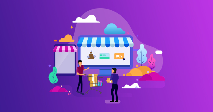
What Is an Ecommerce Landing Page?
An ecommerce landing page is simply a web page that’s been created with one purpose: to convince visitors to take up an offer. Ecommerce landing pages are designed to sell goods and services by promoting key features and using call-to-actions.
Defining the Intent of Your Ecommerce Landing Page
When creating the design of your ecommerce landing page you should consider the intent you have for that specific page. I’ll be defining and co-relating the intent of your landing page with each stage of the marketing/sales funnel.
Top Of The Funnel (TOF)
Landing pages at the top of the funnel (TOF) tell your audience about your brand. These demonstrate to your audience who you are and what your brand is all about and often link to social media pages where they can continue to engage with your brand.

Middle Of The Funnel (MOF)
You can also consider having a landing page in the middle of the funnel (MOF) to engage with leads that are already interested in your brand. These landing pages often take the form of lead capture pages that collect small bits of information from visitors (name, email address) in exchange for valuable offers that align with the buyers’ needs, like case studies and industry insights.
Bottom Of the Funnel (BOF)
Landing pages at the bottom of the funnel (BOF) are often sales pages with persuasive content to convince customers to buy. upsell products when the user has closed the purchase. A great idea would be to offer discount coupons or a bundle as it may attract your customers to browse your ecommerce store longer.
If you’re looking for detailed information about ecommerce funnels, consider visiting our blog post on Ecommerce Funnels: An Effective Way to Boost Store Performance. It covers everything from types of funnels, how they work, and measuring the success of these ecommerce funnels.
The 16 Best Ecommerce Landing Page Examples
Let’s look at some great examples of how brands design their landing pages. These examples have not been placed in any specific order.
1. Hello Fresh
Hello Fresh is a great example of a well-made landing page that has really thought through its sales funnel. The content, warm and friendly in tone, introduces the website visitor to the product and the brand before leading them to a cheerful CTA to create their own personalized plan.
The landing page explains what the service is about, the lowest pricing they offer, and their pricing plans. The third-fold of this landing page shows what a customer would find in the box, enticing the user to visit the pricing plan once again. Thus, the call to action here is clear.
Furthermore, the landing page also has a pop-up that offers a $60 off deal to new customers, thus spiking interest in purchasing the product. The landing page also takes the user to a blog showcasing easy-cooking recipes for visitors to try; this encourages new visitors to make purchases, and existing customers to make repeat purchases.
This landing page also has a section with Instagram posts about foods that can be created using the service, helping both first time visitors and repeat customers to engage with the brand.
2. Winc
This ecommerce landing page focuses on the bottom of the funnel visitors, while still engaging with them every step of the way. Winc uses a clear and direct tone that makes the process of shopping for wine an easy and personalized one. The landing page shows the top of various wine bottles, and the CTA directs the user to a form that is fun to fill out, and which helps them choose their preference.
Another reason why this landing page stands out is the sense of humor in the content. They’ve managed to keep the tone casual, friendly, while also catering to their target audience.
Launch Your Ecommerce Website in 1-Click with the Ecommerce Starter Bundle
Cloudways Ecommerce Bundle includes all the right ingredients for an ideal Ecommerce website along with 10+ pre-installed plugins.
3. FabFitFun
FabFitFun is a gift box service that provides subscription-based premium products on a monthly basis. The first fold of the landing page demonstrates this through visuals. The CTA takes the user directly to where they can get this box, navigating down to the form on the same webpage.
The landing page also shows a preview of multiple bundles of premium products FabFitFun has to offer. They show as a delightful slideshow that keeps the user engaged and absorbed in the webpage.
4. Doodly
Doodly’s is one of the best ecommerce landing page examples. It perfectly uses engaging video content to show how simple and easy it is to create cartoons and visualizations to make your ecommerce webpage attractive.
There’s a clear CTA that gives the user the option to try Doodly services and test out how it works. The landing page goes into more detail explaining how the service works and all the features it offers in its standard and premium plan.
From introducing visitors to the brand, to demonstrating its social virality through positive reviews, to directing BOF visitors to “get Doodly”, this landing page effectively makes use of the sales funnel to increase conversions.
Creating WordPress Landing Pages via Visual Composer
5. LivWatches
This landing page helps visitors easily gauge that this company is all about fashionable designer-wear watches. The LivWatches ecommerce landing page example introduces the product and continues to tell a story about the brand. The CTA takes the user to an inner page that shows the price tag of certain watches and stats on the pledges of new products.
From an introduction to the product and the brand’s story, the landing page goes on to a product list of popular watches that have been ordered, along with a small section with reviews from existing customers.
6. Ascent Footwear
Not every ecommerce landing page has to be fancy and glittery. Ascent Footwear is a good ecommerce landing page example of a page with simple and functional content. Considering the price of the products, the company designed the landing page keeping the target audience in mind, who would be more interested in discounts and a variety of products.
The CTA here sends the user to the loyalty program where customers can earn loyalty points on every purchase. The landing page also has a section that shows a variety of trending products that they sell, and a discount deal that new and existing customers can avail.
7. BoxyCharms
In contrast to FabFitFun, BoxyCharm provides a monthly subscription-based gift box service for a very targeted audience. Since their product is mainly female cosmetics, they’ve used a similar tone in their landing page copy.
The CTA here navigates the user down to another section of the landing page where they can see the different subscription options they can choose. The overall user journey here is short, taking visitors exactly where they want to go without throwing in distractions.
8. Thistle
Thistle provides health-conscious folks a convenient way to order food that’s both tasty and easy on the calories. Notice how they have used a minimalist design themes with a green color to demonstrate eco-friendliness, health, and wellness in their message.
The CTA is simple and straightforward, while the tone is casual and easy to understand. After clicking on the CTA, the user lands on an inner page where they can quickly and easily subscribe manually or sign in via Google.
Within the landing page, the company has a dedicated section for healthy food options, and a small section that explains the pricing based on a meal or a week.
Learn A/B Testing Experiments to Improve Your Landing Page
9. WaterDrop
WaterDrop is another wellness-oriented example of an ecommerce landing page that has been designed for a very specific niche. They sell capsules that add flavor to water and encourage fitness enthusiasts to stay hydrated.
They’ve chosen a light color palette and a minimalist theme. The CTA can be seen directly on the first page, encouraging the website visitor to browse their online store, which showcases merchandise attractively.
WaterDrop’s landing page also has a dedicated section with customer reviews and feedback about their product. They’ve provided a link to connect with their Facebook community for potential customers that want to know more about the product.
10. SoloStove
SoloStove has an ecommerce landing page with a bold visual tone. They sell outdoor cooking equipment against an orange and black color combination that represents bold and energetic vibes.
They have a CTA right off the bat, which navigates the website visitor to an inner page showing various products with their pricing and description. The landing page shows various product categories, hot deals, popular products, and a subscription section for people to sign up for deals and giveaways.
The company’s landing page also has a dedicated section for social media uploads to refresh content. For enthusiasts who prefer to visit SoloStove’s physical store, the landing page has a section to find an authorized dealer.
11. Nathan Sports
The ecommerce landing page of Nathan Sports is an example of connecting the product to the right audience. The company has used sporty colors and bold messages to attract its target audience. Furthermore, the CTA directs the website visitor to an inner page where they can browse products according to section and criteria.
There’s a designated section near the bottom for website visitors that shows trending products that have been bought. The content here encourages new visitors to purchase a product through discounts and deals.
12. MeowBox
MeowBox is the ideal ecommerce landing page for pet lovers. Fittingly, the theme on this landing page is comforting, nurturing, and the content tone soft and easy to understand.
The landing page has two main CTAs; the first for users that wish to start a subscription box, while the second CTA is for users that wish to make a one time purchase. Each CTA takes the user to a separate inner page that provides more details about the products and services being offered.
Within the landing page, you’ll find a section that explains what the MeowBox service comprises, and another section for users that wish to join the official Facebook MeowBox page.
13. Savile Row Company
Savile Row Company has a great ecommerce landing page example that sells finely trimmed shirts, suits, and accessories for men. Right of the bat, you’ll see the landing page showing multiple accessories, such as COVID masks, suits, shirts, and trousers.
The landing page shows a 20% off deal on everything for new customers, both for men physically going to the office, and those working from home. The discount deal is a simple banner that takes the user to Savile Row Company’s online store.
14. WoodWorkers Guild of America
WoodWorkers Guild of America has an ecommerce landing page selling tutorials and videos on woodworks. The landing page shows a banner for people looking to sign up for the standard or premium membership.
The landing page also packs multiple video categories, from the latest uploads to their top woodworks project. They also have a small section towards the footer of the landing page that is dedicated to giving social media proof for those customers that wish to join the community.
15. Marley Spoon
Marley Spoon is a recipe and box delivery meal service in Australia that provides all sorts of meal kits. The box meals vary in healthy eating, vegetarian diets, burgers, and snacks. The landing page here is energetic and fun, as they show the different kinds of meals available along with a CTA for people that want to place an order or subscribe for a weekly plan.
Furthermore, the landing page also comprises meal recipes to get food enthusiasts curious and excited about the different meals they can expect. They can also check the suppliers, and even meet the chefs that propose certain recipes for customers to try out.
The landing page has a dedicated section for those who wish to read reviews from other customers or connect with Marley Spoon’s social media platforms.
16. Troubadour
Troubadour is a great ecommerce landing page. The theme works very well with sporty and travel bags that can be used in both casual and business outfits. The CTA here takes the website visitor to the online store showcasing products based on filters.
The design is overall minimalistic, and the parallax style makes it easy for the user to navigate and find what they’re looking for.
Creating an Ecommerce Landing Page that Converts
When it comes to landing pages for an ecommerce store, there are a few ‘must-have’ elements you should ensure. In the section above, I have already gone through some of these elements along with their real-life applications.
Site Navigation
Most landing pages are part of a marketing/sales funnel that target customer. Hence, they are built with the purpose of pulling these customers to a specific page or action. Avoid page elements that could distract potential customers from the actions you wish them to take.
Call to Action
Every ecommerce landing page requires a CTA, whether it’s an add to cart or a signup opportunity. The CTA helps give a clear message to the webpage visitor and tells them what action is required of them. This is why most CTAs have short and clear messages that are easy to follow through with.
Additional Call to Actions
Having more than one CTA is risky but this can reap amazing results if executed well. Sometimes website visitors at the top or middle of the funnel may not be ready to make a purchase yet. Hence, it would be a lost opportunity to not nurture them as leads – which is why some landing pages have multiple CTAs to target multiple personas within the target audience pool.
Product Descriptions and Additional Content
Ecommerce landing pages often need to have a section with the company’s products/services and a description that suits the audience the landing page is targeting. You’ll find this a common occurrence in many landing pages (also in the examples from the previous section) as trending products or specific products that better fit the audience.
Source: Weber
SEO Optimization
Ecommerce landing pages rely heavily on SEO optimization to reach the right audience. Although a lot of brands design unindexed landing pages to target a specific niche, product pages on the other hand are heavily optimized to pull organic traffic. ROAS (Return on Ad Spend) is a metric often used to measure the conversion rate on these landing pages.
The Best Practices to Follow When Creating a Landing Page
If you want your ideal buyer to convert, it pays to know what makes them tick.
1. Have a Single Focus Aimed at A Buyer Persona
Using marketing personas makes sites 2-5x more effective and easier to use by targeted users. The sole focus of your ecommerce landing page design should be to lure in your ideal buyer with an offer that appeals to them specifically. Or provide a solution to their problems in the form of your product, be it physical or digital.
Take a look at this landing page from TheVeganKind:
Source: The Vegan Kind
This presents a solution to the ideal buyer’s pain point, i.e. it’s difficult and too time-consuming to find vegan products when you have a busy lifestyle.
Key Takeaway:
- Link customer pain points to individual products or offers. Create a landing page solely dedicated to the solution to your ideal buyer’s problem.
2. Provide Only One Offer per Landing Page
Landing pages with multiple offers are not as effective as those with just one main offer.
Have you ever been presented with a long list of fantastical cocktails at a bar?
It’s difficult to pick just one, so you end up opting for your standard whiskey coke or beer. Similarly, if you present too many offers to your customers, their indecision may mean that they don’t choose any of your offers. It makes it harder for them to come to a purchase decision.
Here’s an ecommerce landing page example of what not to do:
Source: Holzkern
The competition on the right is an enticing offer which should have been the focus of the landing page.
Instead, there are too many distracting options.
Key Takeaway:
- Choose your best offer and make it the sole focus of your page.
3. Make It Benefit-Oriented
Your headline and copy should focus on the benefits of your product rather than its features.
A feature-oriented copy is boring and unappealing.
Plus, customers don’t always understand or need to know the specs of a product.
For instance, consumers want to know that a laptop is fast, not that it has an Intel Core i5 Processor…
Most people have no clue what that is.
Check out this benefit-oriented ecommerce landing page example from Snow:
Source: Try Snow
They don’t take a deep dive into the specific chemicals of their teeth whitening system.
Rather, they outline numerous benefits in a small amount of copy: it’s fast, cruelty-free, long-lasting, easy to use, safe and so on.
Key Takeaway:
- Highlight the value of your product to show visitors exactly why they need it in their lives.
4. Focus on Conversions
Your homepage or product pages might be optimized for SEO.
Your landing page doesn’t need to be—it should be optimized for conversions instead.
CRO is becoming increasingly important in the world of e-commerce.
Over 60% of ecommerce companies have a specific individual or team dedicated to CRO.
You should build your landing page with CRO in mind as its purpose is to make sales, not to perform well in the SERPs.
Take a look at this ecommerce landing page example from FabFitFun:
Source: Fab fit fun
The copy is snappy and kept to a minimum, which would not be the case if SEO was the focus.
They also use multiple CTA buttons to really drive the message home.
Key Takeaway:
- Employ CRO tactics, such as multiple CTA buttons, to encourage sales.
5. Utilize Social Proof
The best landing pages for ecommerce always contain some form of social proof.
The reason being, it’s so effective in helping visitors come to a purchase decision.
78% of consumers trust online reviews as much as recommendations from friends and family.
Social proof can also take the form of endorsement from celebrities/influencers, for instance, along with testimonials and review scores.
Here’s a nice (and humorous) example from Squatty Potty:
Source: Squatty Potty
It works because it makes you think, 5 million people can’t be wrong … If it didn’t work then why would so many people use the product?
That’s exactly what social proof is supposed to do.
Key Takeaway:
- Add social proof, such as your best reviews or customer count, to speed up the decision-making process.
6. Optimize Your Landing Page Design
There’s a whole set of best practices for landing page design.
Firstly, you should take out any clutter, such as the navigation bar.
Clutter only gives visitors an excuse to leave your page.
And, as mentioned previously, distractions act as an obstacle to making a purchase.
Furthermore, you should use high-quality, non-stock images.
They show the authenticity of your brand and appeal to the desires of customers.
Perhaps, the most important design tip is to have vital elements above the fold, such as your headline and CTA.
If visitors usually bounce within 8 seconds, then you want them to see your value proposition straight away.
Any further information, such as social proof, can go below the fold.
Blue Apron knows how to design an ecommerce landing page effectively:
Source: Blue Apron
Note how the images, headline, and offer hit you straight away.
Then, you can scroll further to learn about the details of the product.
Key Takeaway:
- Stick to the best design principles, e.g. decluttering the page, to keep users engaged.
7. Include Any Extra Benefits
The best ecommerce landing pages are those that are minimalistic!
But you may wish to include the key points customers need to know in order to make a purchase.
The three things customers value most when choosing an online shop are price, shipping cost/speed, and discount offers.
A discount offer may be the main focus of your landing page.
But you may also include extra benefits, such as shipping rules, finance options, subscription discounts, trust seals and so on.
Everlane keeps it simple:
Source: Everlane
They only mention, “Free shipping on your first order.”
You could always test which pieces of information increase conversions, to work out what to include.
Key Takeaway:
- Include any extra benefits that lead to more sales, such as free shipping.
8. Monitor User Behavior
Continue to improve your ecommerce landing pages through testing and monitoring.
Companies that carry out 50% more tests benefit from increased conversion rates.
There are numerous tools out there that you can use to test and monitor user behavior such as CrazyEgg and Hotjar.
These tools offer visitor recording, heat maps and A/B testing, which are helpful for improving elements such as copy, CTAs or design.
Klientboost A/B tested hero images for their client Tyme:
Source: Tyme
The second image showed a 44% decrease in conversions.
So, naturally, they found that the first image was optimal.
Key Takeaway:
- Use heatmapping or A/B testing software regularly to monitor user behavior and thereby improve your landing pages.
9. Track Key Metrics
Track the right metrics to see how your landing page is performing.
We’ve talked a lot about conversions here, but you can’t just track conversions alone.
If you coached a soccer team, you wouldn’t simply track the number of goals scored.
You’d have to track how your team is performing defensively, too, in order to improve overall performance.
The most important ecommerce landing page metrics are:
- Landing Page Views
- Views by Source
- Bounce Rate
- Session Duration
- Add to Cart Rate
- Cart Abandonment Rate
- Conversions
Each of these will help you fine-tune your landing page and marketing efforts.
Use tracking software, such as Google Analytics, to monitor metrics.
Key Takeaway:
- Track several key metrics so that you can tweak elements of your landing page and marketing/promotion.
In a Nutshell
There’s a lot to take away from this article, from the common elements and practices that improve the conversion rates of ecommerce landing pages, to some of the best ecommerce landing page design examples (with their breakdown) to help understand what makes these landing pages successful.
If you would like to add some more landing pages into the discussion, just add them in the comments section below and I’ll be happy to discuss their elements.
Q. What is a landing page in ecommerce?
A. A landing page in ecommerce is a dedicated webpage designed to capture a visitor’s attention, encourage a specific action (like making a purchase or signing up), and promote a particular product, service, or offer.
Q. What is an example of a landing page?
A great example of a landing page could be a promotional page for a seasonal sale, featuring a discount code and a call-to-action to buy a featured product.
Q. What’s the difference between a website and a landing page?
A. A website is a collection of interconnected pages offering a variety of information and navigation options, while a landing page focuses on a single goal or offer, without distractions, to drive conversions.
Q. What does the perfect landing page look like?
A. The perfect landing page is visually appealing, easy to navigate, with a clear headline, a compelling offer, a strong call-to-action, and relevant content that resonates with the target audience.
Owais Khan
Owais works as a Marketing Manager at Cloudways (managed hosting platform) where he focuses on growth, demand generation, and strategic partnerships. With more than a decade of experience in digital marketing and B2B, Owais prefers to build systems that help teams achieve their full potential.


